Internship
Built various experiences & interface systems that helped Ontarians access jobs, resources, and skills training in a quick and efficient manner.
During my time at the Government of Ontario, I worked in the Ministry of Labour, Immigration, Training and Skills Development. My first month started off with a lot of training material and learning about how the internal systems worked.
This initial month of studying allowed me to excel at the projects that I completed within the various sub-teams that I worked in, during the subsequent three months. Each project had its different goals, but the over-arching theme between them included tackling how both users and clients would interact with employment services. This uncovered a problem that had to be addressed, the problem of onboarding new-hires and interns.
UI Design, UX Research, Prototyping, Presentation Compiling & Designing
May to August 2022
Currently, the business development unit didn’t have a good system to onboarding new hires, particularly interns and fresh graduates. The current system was to send a bunch of old slide decks and pdfs for them to review. After Identifying this issue, I realized that I was in this position so I had just experienced the many pain-points that an intern would, first hand. This led me to compiling insights from both my own experience and interviews conducted with other interns.
A checklist was useful for new-hires in understanding what tasks they had to complete.
Having resources readily available is valuable as people like to reference material.
People used their government issued laptops, meaning there was no use for mobile-first.
A checklist was useful for new-hires in understanding what tasks they had to complete remove_red_eye
Build a new platform on Microsoft PowerApps BI that encompassed the resources and checklist features that a new-hire would need to access.
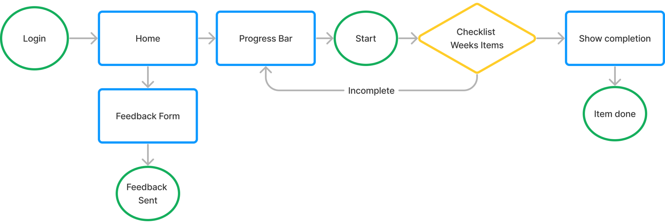
The previous user-flow
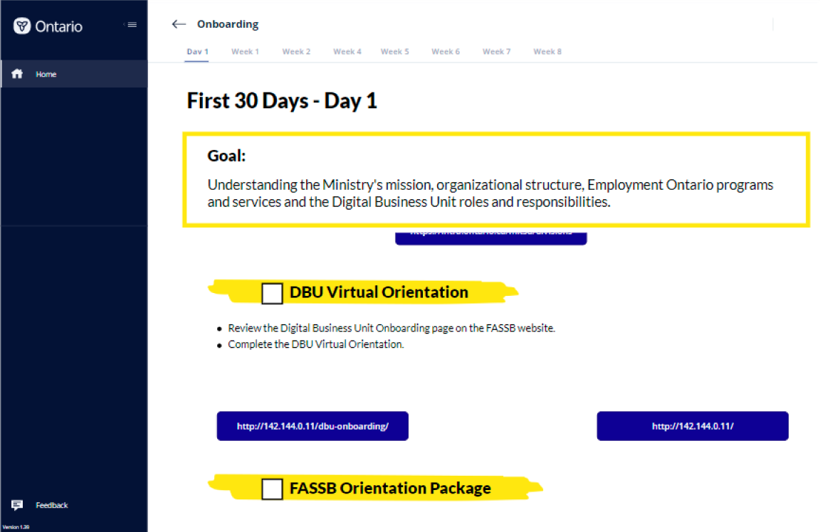
The old Powerapps BI app task-screen
cancelUsers had a very linear method of navigation.
cancelLimited number of options to learn from as a new hire.
cancelNot enough features or modularity for managers to find useful.
+ Files were constantly getting lost because they were just sent over teams chats.
1Create a mvp prototype of most features for the onboarding platform to be developed on Powerapps BI
2Allow for modularity that enabled managers and supervisors to add/remove resources
3Enable an experience for new-hires that felt like they could utilize throughout their internship period
ProcessPlan & Understand
Design
Prototype & Develop
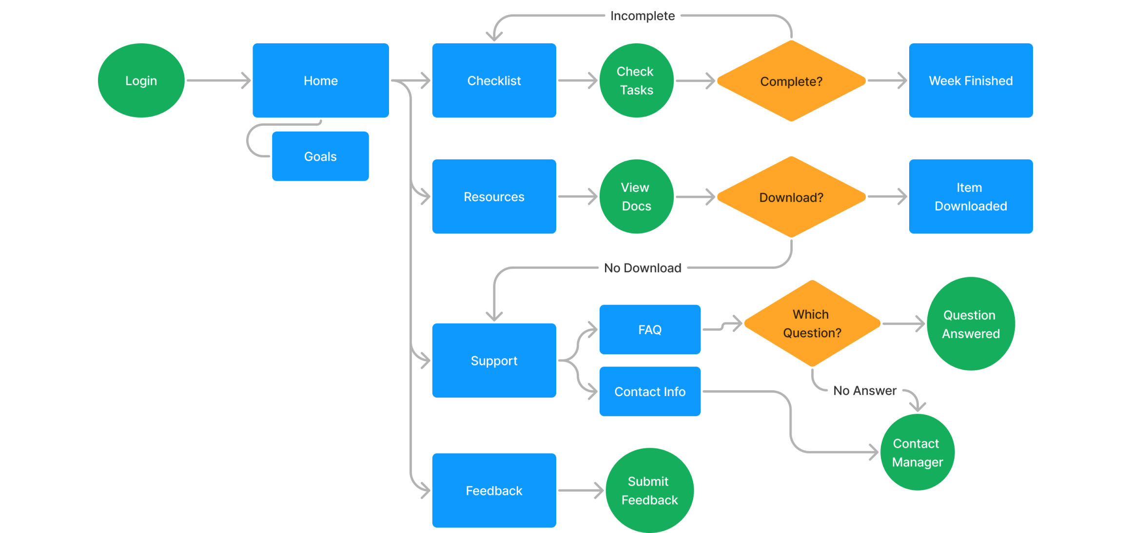
The updated user-flow
What changed?
check_circleExplorative form of navigation to allow new-hires to learn at their own pace.
check_circleMore options and resources to self-learn, Reducing workload for managers.
check_circleModularity for management to add/change items as needed.
A key feature
Managers across teams really loved the idea of adding a “goals-100-day-plan”, which originated from an excel worksheet that had been used previously. This meant we needed to add this alongside the tasks list as a key feature.
The previous excel-sheet that was used to onboard some teams
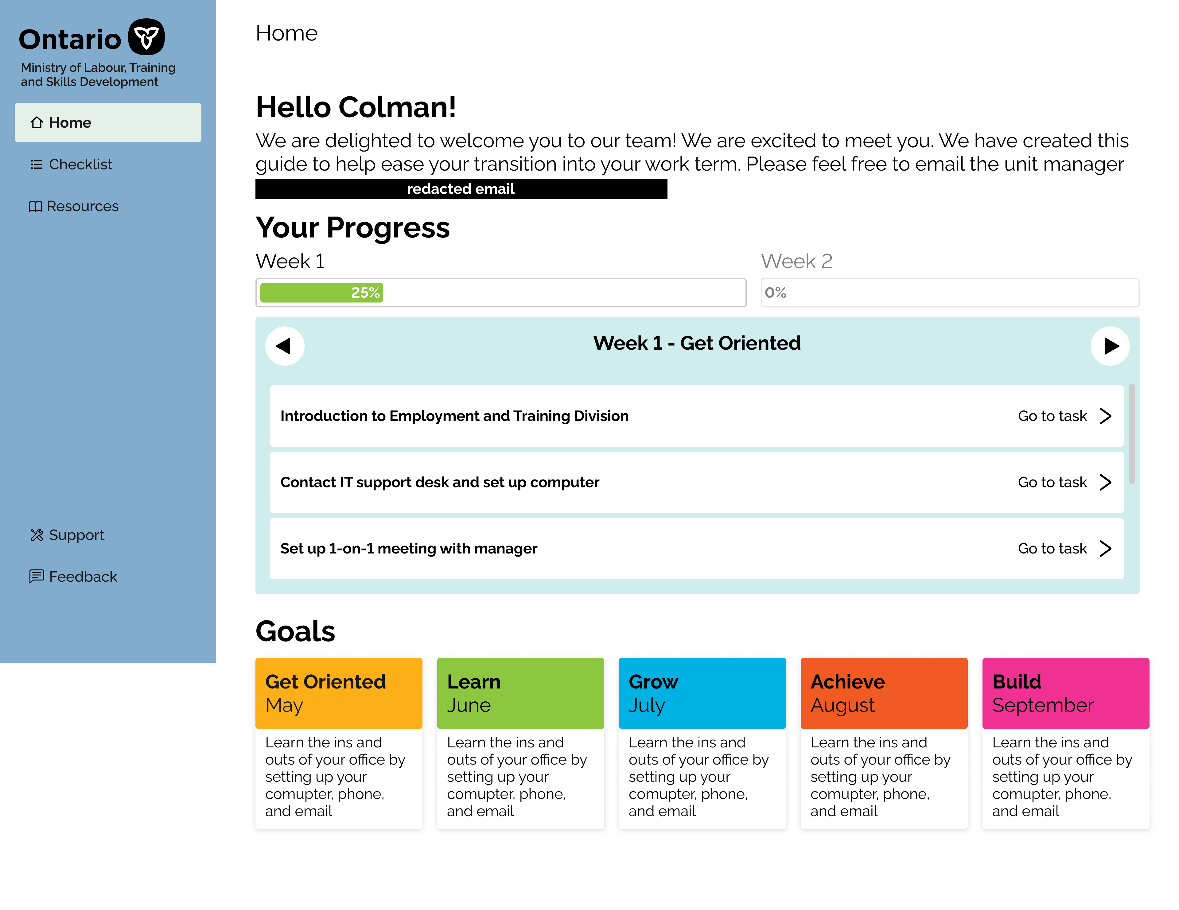
Home Page Key Features
Welcome Message
This welcomed the users and gave them an email for their direct manager.
Progress Bar and Task List
Gave an overview of what needed to be completed for the week and how far along they were.
Goals
A modular goals panel that managers could change depending on what their unit needed.
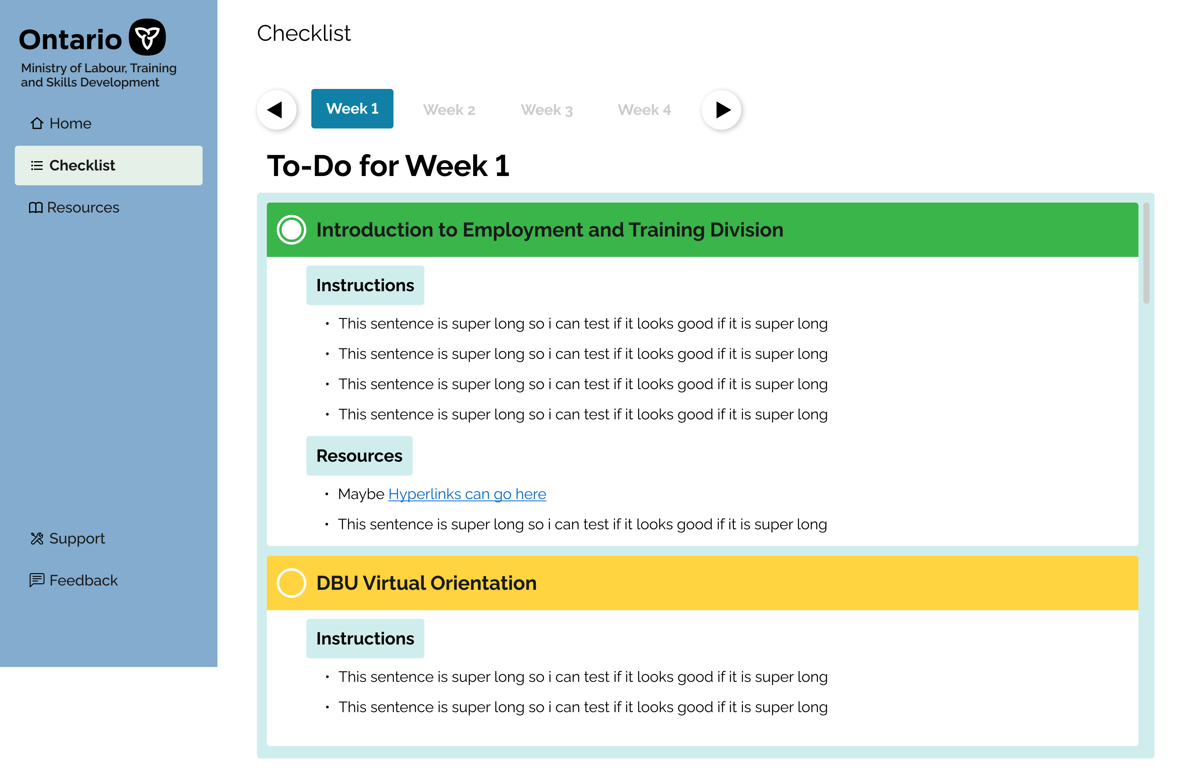
Checklist Key Features
Weekly Tabs
This allowed proactive interns to take a look at what they could expect for in the future.
Coloured check-off headers
Adding colour enabled users to understand at a quick glance which tasks needed attention first.
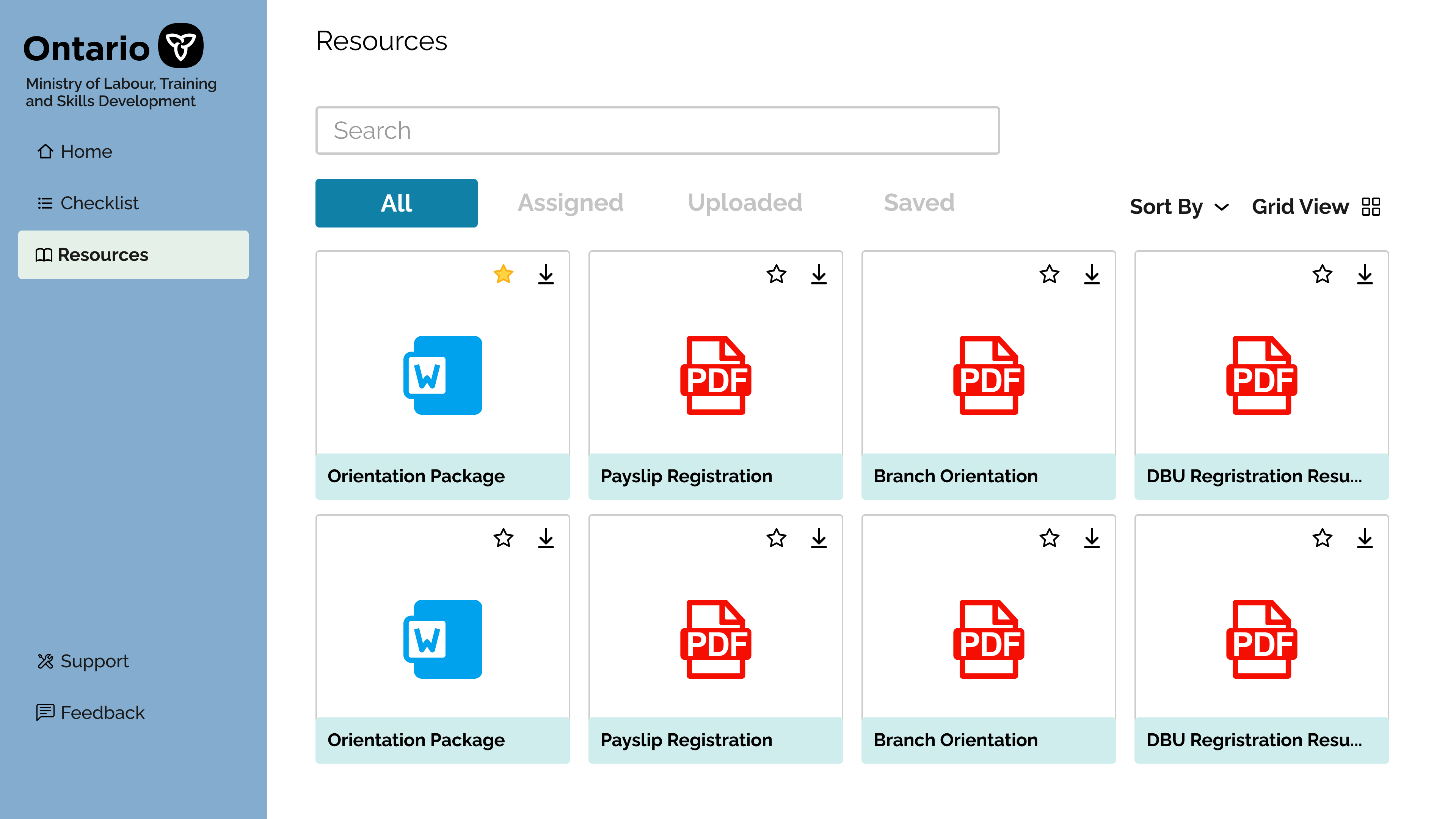
Resources Key Features
File sorting
Lots of files were given to new hires, having a file sorting and search feature was crucial.
Favourites
This was useful for files that had to be accessed frequently, moving it to the top of the sorter.
Managers were ecstatic to see the high-fidelity prototypes, and we were in the process of implementing it onto a live version on PowerApps. The designs got handed off to the development team to further develop.
The onboarding application turned out to be a tool that we were able to develop partially on PowerApps BI. We ran out of time to fully build the product out, but there is still development happening within the team for the application. Additionally, building this product really required a deeper understanding of how hiring managers and mentors approached this problem traditionally, to see what we could help to build upon their training experiences for the new hires.
Creating an easy to use and trustworthy questionnaire experience for Ontarians seeking employment.
UX/UI Design, User Research,
Prototyping, Email Design
Colman Tsang
Romina Esparza
May to August 2022
An overview
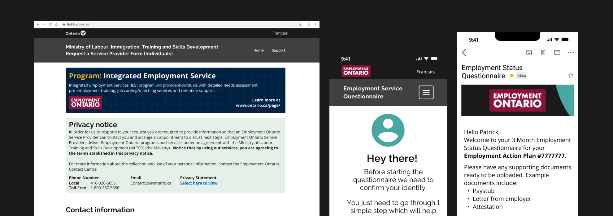
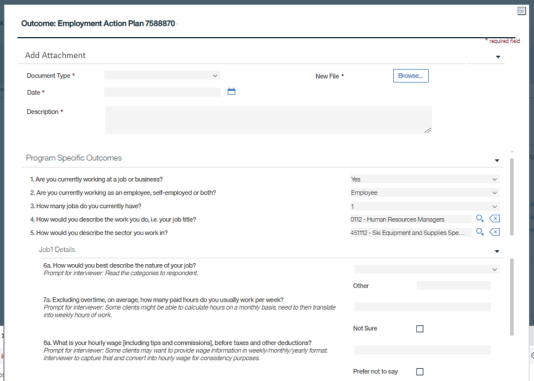
The employment service questionnaire was part of a program that the operates alongside Employment Ontario offices. My role was to re-design the email and questionnaire web-pages that a client would see upon enrolling in the program. This connected process involved multiple areas of government to help develop and design into a coherent machine for external providers.
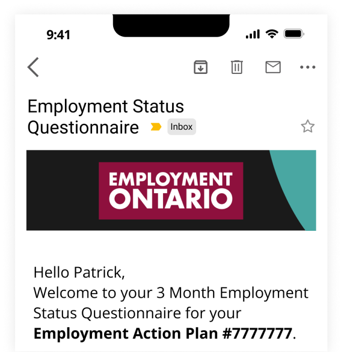
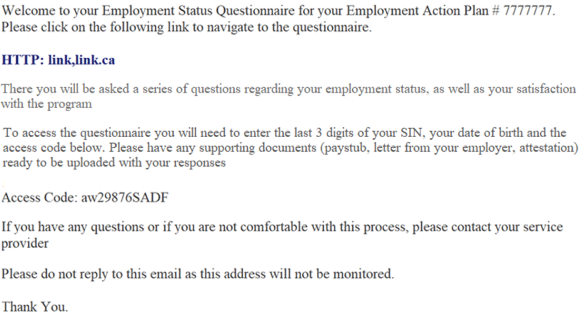
The existing emails sent out for the employment questionnaire looked like generic text heavy emails, and had little Ontario branding. This led to more problems as the questionnaire also wasn’t a mobile-friendly website for clients to fill out the questionnaire. We learned a few problems had to be addressed, these problems included:
We focused on a mobile first because clients would use phones over computers.
Important data points were not collected because people didn't find the site usable.
The entire process had outdated branding and designs that did not align with Ontario.
These insights helped us conclude that: remove_red_eye
A complete re-haul on how the initial email design looked, and a re-design for the included questionnaire survey that included Ontario's branding and design systems was necessary.
cancelText-Heavy
The text had no visual hierarchy, often leading to clients missing important pieces of information.
cancelNo Icons
The entire process had little to no visual cues. Icons served as a great tool to help visualize key points.
cancelDesktop first design
Clients were often on-the-go, meaning we needed a mobile-first approach.
1Re-design the pre-questionnaire emails according to ministry and government guidelines
2Apply mobile-first design strategies and usability to the client-facing questionnaire website
Mobile surveys and questionnaires are a popular method of data collection. I conducted a competitive analysis and took a look at existing popular tools like SurveyMonkey and Google forms and external surveys. I also analyzed internal government tools such as the Ontario Design System and Canada’s Federal Design guidelines.
1. Design guidelines were useful when trying to align an email template designed for the masses.
2. Well designed questionnaires open up users to answer questions in a way they may not have thought about.
3. Utilizing both icons and buttons helped to digest text easier, as there was less to read.
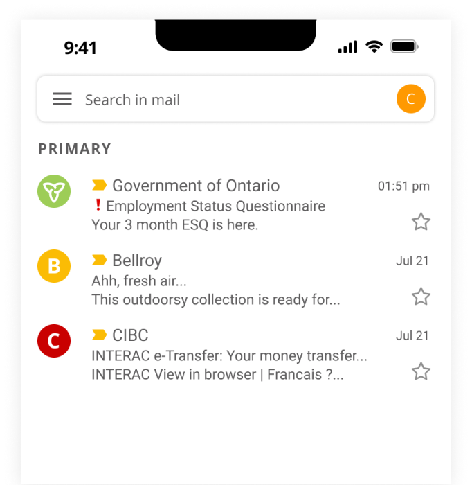
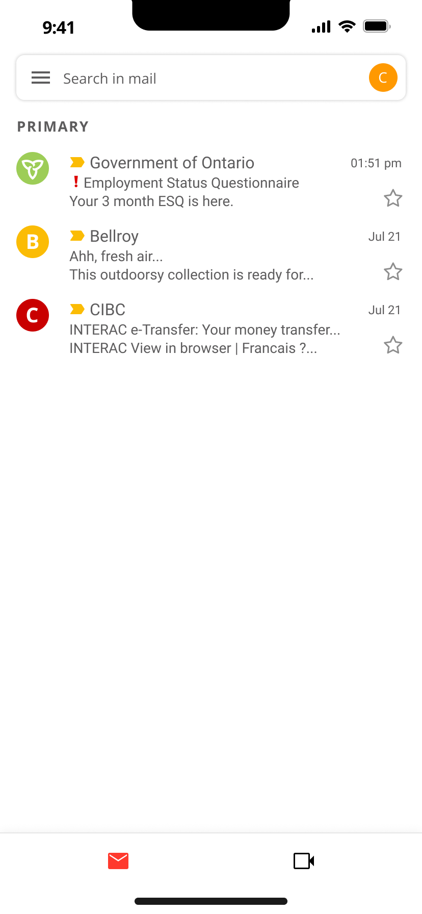
Inbox
To capture the client’s attention from the inbox, emojis were utilized within the email header.
Official Government of Ontario logos and branding was used in the profile picture.
Email
Emphasized text-hierarchy to help prioritize what a client needed for their next steps.
Re-designed banner to align with Ontario’s official branding and encourage client trust.
Clear call-to-action button, encouraging clients to proceed with questionnaire.
Key Updates - Adapting Ontario's Design System Kit
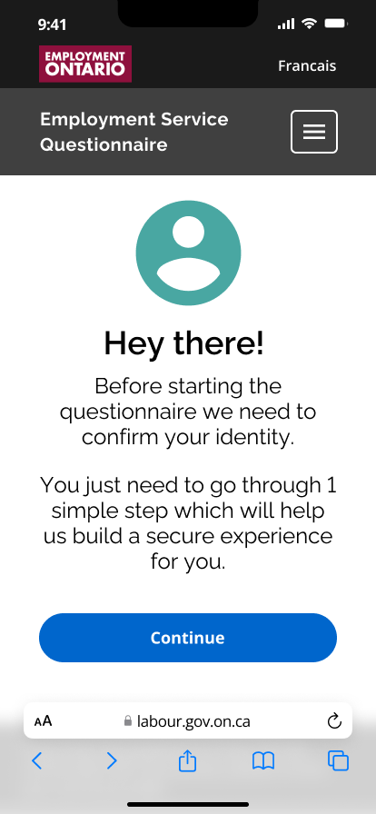
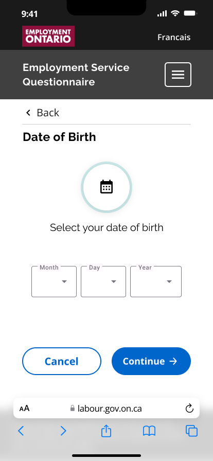
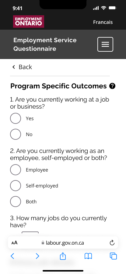
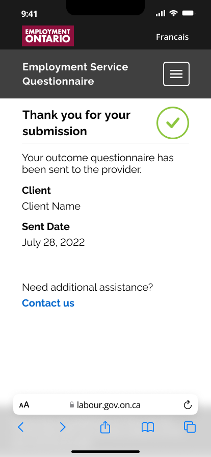
The main changes here involved applying Ontario’s design system towards the questionnaire. I also followed mobile design best practices to help create a more engaging mobile experience. A single-page design per-action was adopted, and call to action buttons along with clearer UX language was utilized in the questionnaire.
I’m happy to say that internal management was over the moon about this re-design. The project has since been shipped and handed over to the development team and has been under-development since I left. When the live product launches, this will be able to help transform Ontario’s employment office clients across the province.
Takeaways & lessons learntThrough working with the various teams that work on this project, I have learned the importance of mobile-first design. Additionally, I learned that working with existing design systems such as the one utilized by the Government of Ontario has many pros and cons that I had to learn to design around.